mne.viz.plot_ideal_filter(freq, gain, axes=None, title=”, flim=None, fscale=’log’, alim=(-60, 10), color=’r’, alpha=0.5, linestyle=’–’, show=True)[source]¶Plot an ideal filter response.
| Parameters: | freq : array-like
gain : array-like or None
axes : instance of matplotlib.axes.AxesSubplot | None
title : str
flim : tuple or None
fscale : str
alim : tuple
color : color object
alpha : float
linestyle : str
show : bool
|
|---|---|
| Returns: | fig : Instance of matplotlib.figure.Figure
|
See also
Notes
New in version 0.14.
Examples
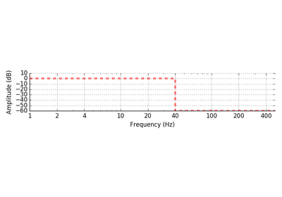
Plot a simple ideal band-pass filter:
>>> from mne.viz import plot_ideal_filter
>>> freq = [0, 1, 40, 50]
>>> gain = [0, 1, 1, 0]
>>> plot_ideal_filter(freq, gain, flim=(0.1, 100))
<matplotlib.figure.Figure object at ...>
mne.viz.plot_ideal_filter